Game-changing branding to reflect a levelled-up identity
Branding & Website
Abstraction is a creative game studio whose focus is on developing its own IP and co-development. Games from the Abstraction portfolio include: Dune, Surviving Mars, Halo and Mass Effect.
In the past, Abstraction was primarily known for its strength in multi-platform porting and adaptations. But the scope has shifted in recent years. Abstraction has moved on to developing its own IP, and adaptations have become part of the broader picture.
Unfortunately, the brand never managed to evolve along those lines. That is why we have come together and have reopened the Abstraction DNA to started building a future-proof brand from there.
Awards

Brand strategy
We held several collaborative workshops that gave us the opportunity to observe, analyse and draw conclusions. That's because you can only become what you want to be if you know who you are.
We then translated our findings into a meaningful brand and came up with the payoff ‘Beyond Boundaries’. That is essentially what typifies Abstraction. They never shy away from a challenge. The bigger the challenge, the better they get.


Brand design & Brand experience
The most visible change is in the name. They have lost their tail, as it were, and are no longer Abstraction Games but simply ‘Abstraction’. This enables them to expand their range of services in the future, without being bound by a descriptive name.
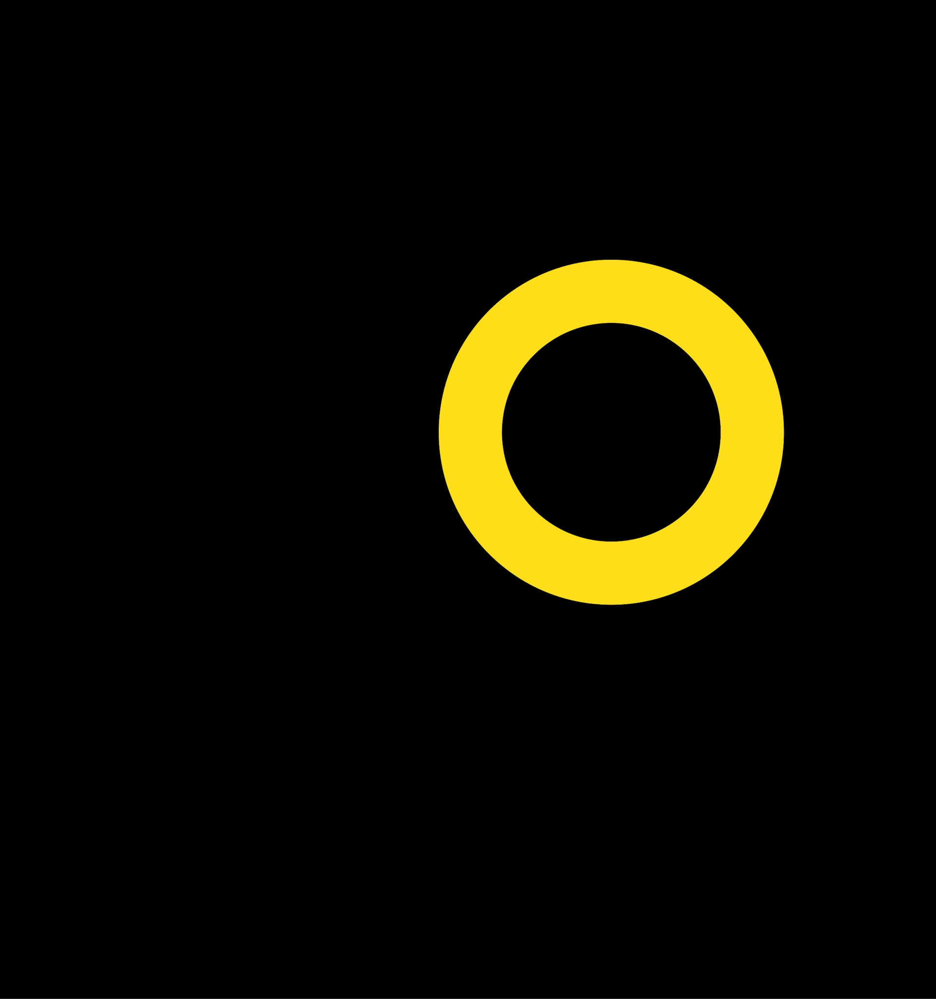
Logo
The new Abstraction logomark symbolises the enduring character of the ‘Beyond Boundaries’ payoff and makes a visual reference to the planetary horizon, behind which a new planet is ready to be discovered. The logotype is written in lower case to add yet another hint of informality. The symmetrical whole makes the logo easy to incorporate into different communication mediums.

Colour & Typography
The new colour palette was derived directly from the preliminary strategic process. The overall impression is one that exudes ‘premium’ and ‘boutique’ by embracing a white/black base palette. Yellow is used sparingly with an eye on informality. The typography is large and ‘in your face’, interspersed with smaller, contrasting typography to achieve an interesting visual effect.


Design language
The ‘Beyond Boundaries’ payoff is bolstered by specific values that are each visualised individually. This makes it possible to visually emphasise certain elements within a message, while at the same time maintaining the brand's recognisability. The style of photography is relaxed, minimalistic and clear. People are included whenever possible, because people are the greatest asset Abstraction has. They are the brand.


Website
A strong brand experience should flow seamlessly through to the digital environment. The online experience has to be at least as good as it is offline. The new Abstraction website proves that the web no longer needs to be static. The website itself literally goes ‘Beyond Boundaries’. A playable version of Pong, a visual reference to Super Mario 64 and the typographic whole create a distinct extension of the brand.
Behind the scenes, a headless CMS has been used to allow data to be (re)used independently of the medium. The Abstraction recruitment environment has also been linked, meaning that vacancies can always be posted live and kept up to date.

Brand support
Branding is anything but a ‘one-off’, and our ongoing collaboration with Abstraction is living proof of that. Our Brand support team provides weekly support in the design and development of content, bannering, magazines and a range of other assets. This is how we help keep the Abstraction brand relevant and ensure an enduring, consistent experience.


“Stuurmen has been able to analyse and present my own company to me in a way I deemed impossible.”

