Now we'd love to get to know you.
Tell us what you are running into, what you want to change and what question lies behind it.
For the last five homes at the top of Wonderwoods, we developed a brand of their own, with the resident's next stage of life as the starting point. The positioning took shape in a visual identity, website and sales materials, and in the way prospective buyers get to know what could become their new home.
G&S&
Real estate, premium living
Utrecht
Brand strategy, brand concept, visual identity, brochure, outdoor advertising, website
2026
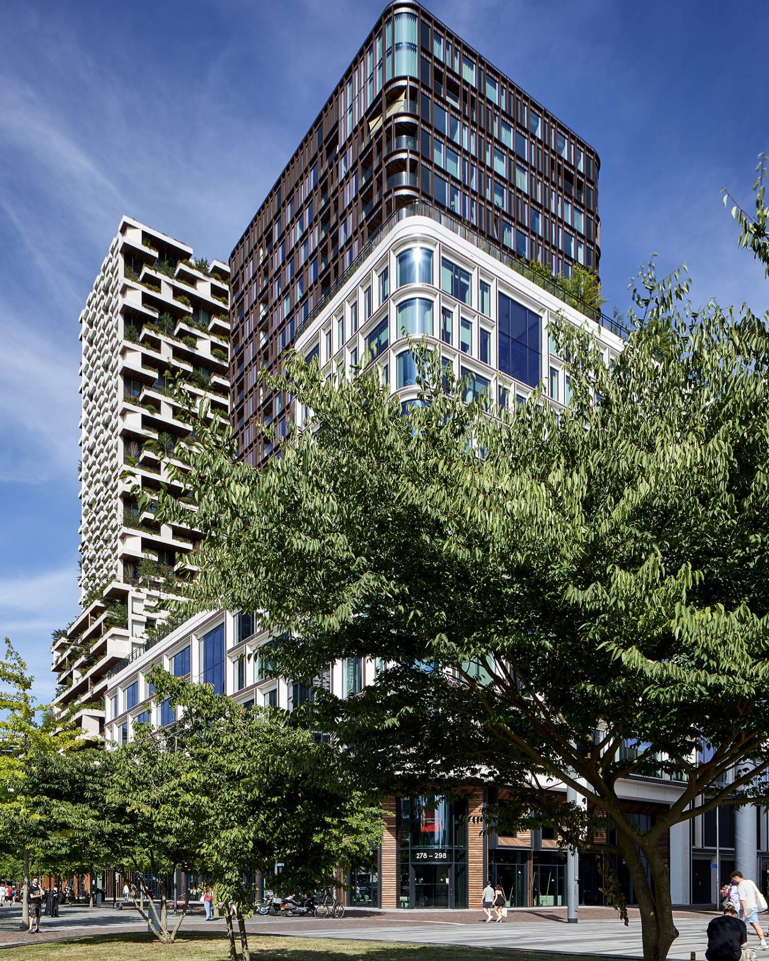
Wonderwoods is the vertical forest next to Utrecht Central Station, designed by Stefano Boeri Architetti and MVSA Architects. The building drew international attention and the regular apartments had sold. Four penthouses and one special remained available, despite the profile of the project and the demand for living in Utrecht.
The approach that had worked for the rest of the building was used for these homes too. Open days, Funda and broad communication had to win buyers over with panoramic views, luxury finishes and a central location. These were the same qualities every other penthouse in the area was offered with.
At the same time, the homes asked for more imagination than that presentation offered. They were spacious, but not detached villas, and the finish still left choices to the buyer. Pointing to the possibilities was not enough for someone considering a new home at this level. They needed a proposition of their own, with an experience that made the value of living at Wonderwoods tangible.
The approach that sold the regular apartments was also used for the last five homes. Their scale, price and level of finish called for a story of their own, one that made clear who they were for and what makes living here special.
Panoramic views, luxury finishes and a central location featured in almost every competing project. What set Wonderwoods apart was the combination of forest, city and height, but in the sales process that connection did not yet mean enough to the buyer.
Children leaving home, handing over a business or the wish to live differently were often what prompted the next step. To reach these buyers, we had to show how life at Wonderwoods could fit their plans for the future.
The intended buyer was used to personal service and attention to detail. Open days and broad communication left little room for that, while a carefully prepared welcome was exactly what could help them feel at home here.
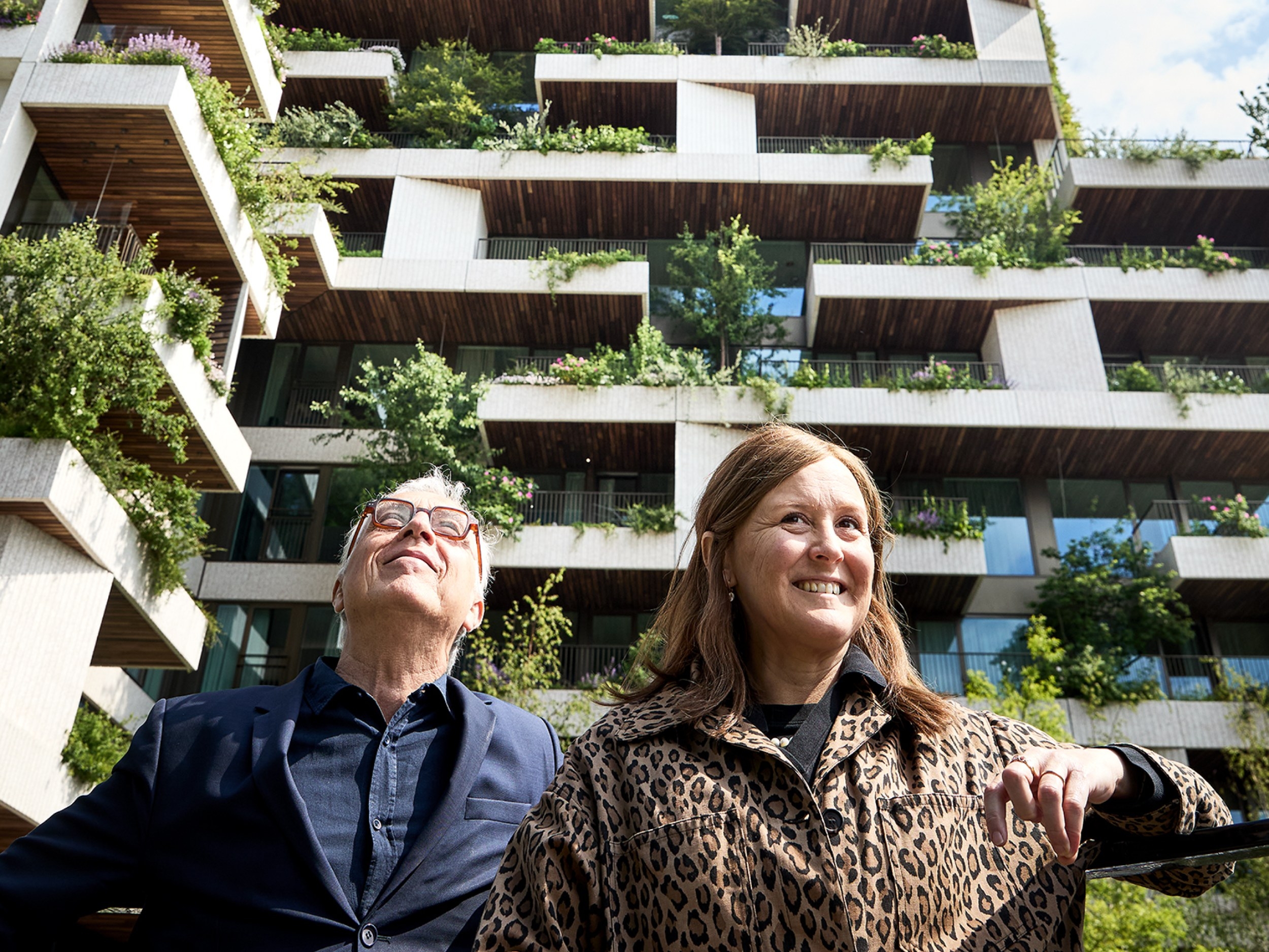
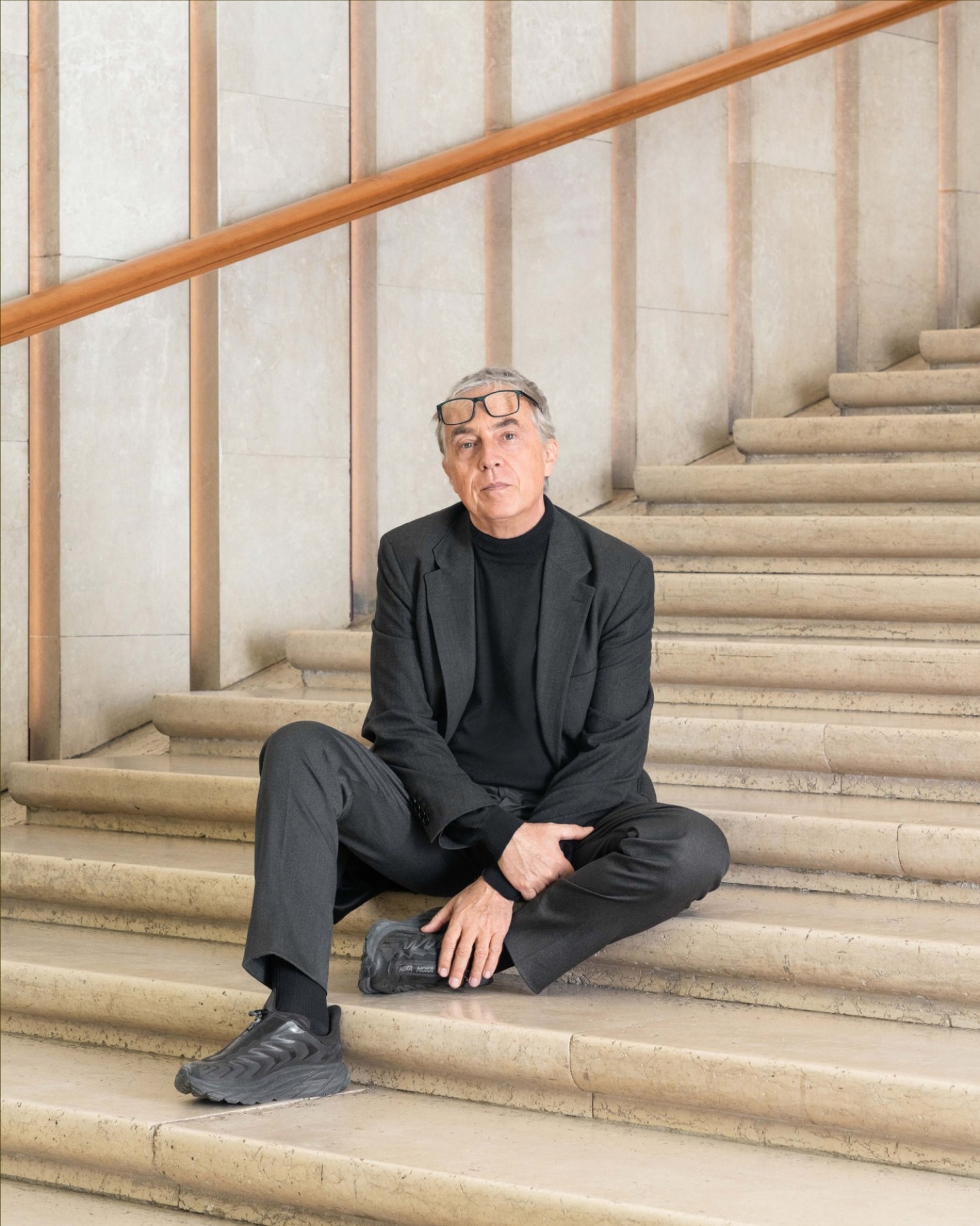
The intended buyer had often built a business or career of their own and had reached a point where life could be arranged differently. The children had left home, a company had been handed over or there was simply a need for a next step. A move grew out of that change, even when someone was not actively looking for a home.
Earlier sales also showed that eight out of nine buyers lived within sixty kilometres of Utrecht. The city was familiar to them and already part of their lives. So it was also about staying connected to friends, favourite places and their own network, while the way they lived changed.
That insight shifted our starting point. We wanted to show who someone could be here and what daily life could look like. The question ‘Can I see myself living here?’ became the guide for the positioning and everything that followed from it.
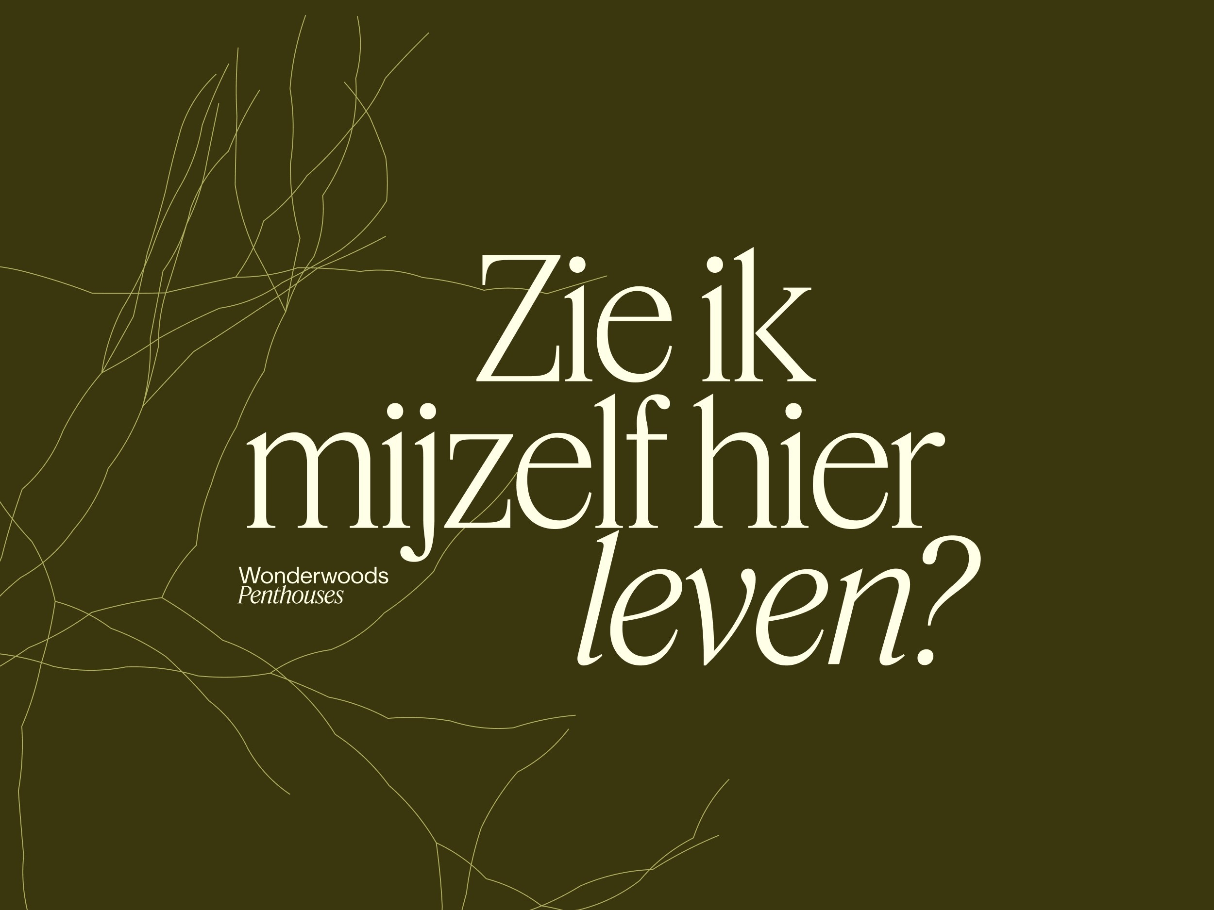
The seasonal concept grew from a quality of Wonderwoods itself. The planting changes throughout the year, so residents experience the seasons up close in the view, the light and the colours around their home. We found the same movement in the buyer standing at the start of a new stage of life.
Your next season of living in Utrecht connects those two ideas. ‘Your’ makes it personal and ‘season’ refers both to the time of year outside and to the period someone is in. With ‘living’, the story is about taking an active part in life: having people over, heading into the city, working from home and being able to retreat. Utrecht gives that life a familiar setting.
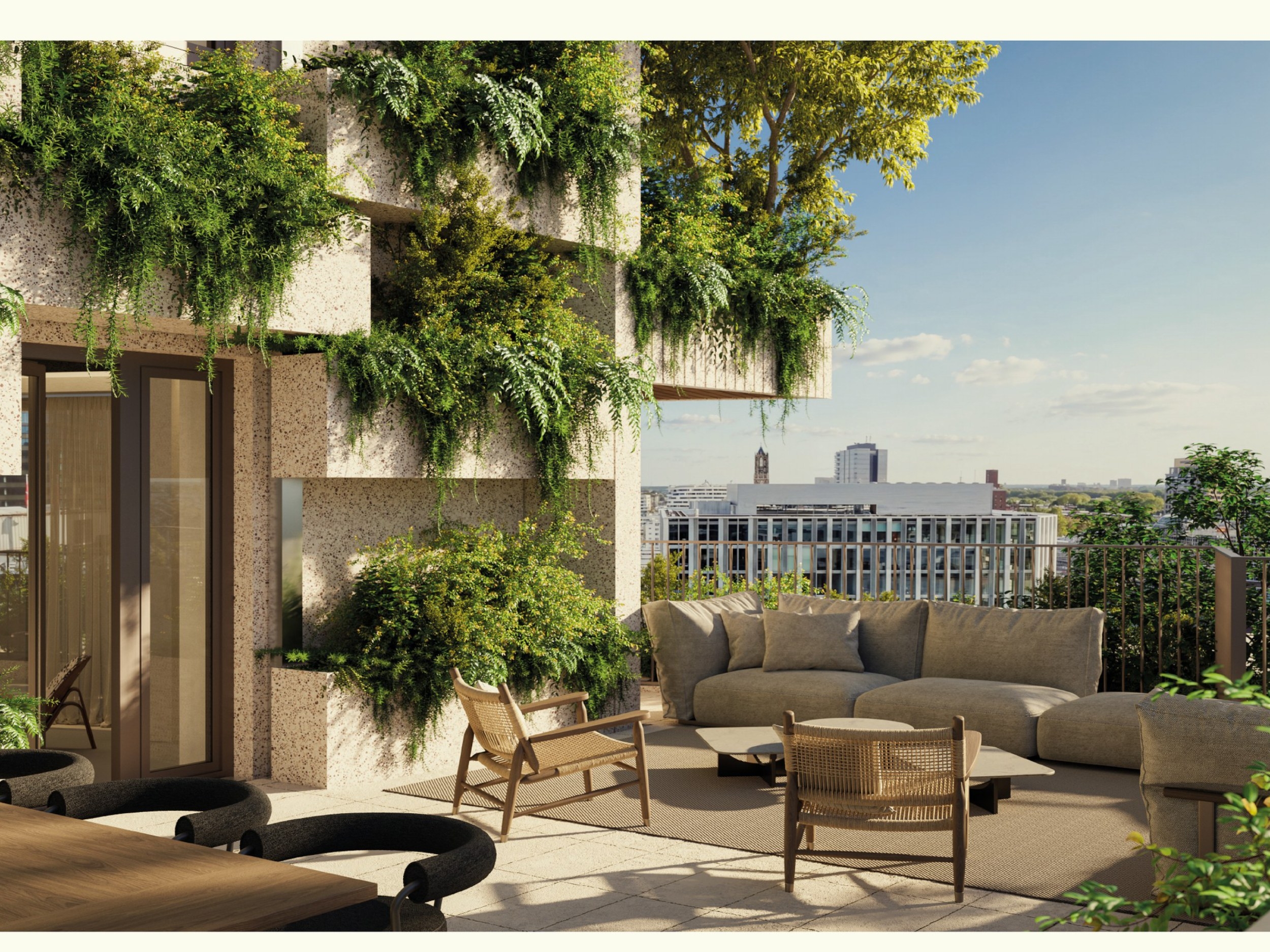
This gave the combination of nature, height and city a central place in the positioning. The vertical forest, inspired by the Utrecht Hill Ridge, brings nature right up to the home. Below lies the city with its amenities and connections, while the view from above offers calm and distance. Together they form the basis of Living in a forest, life in the city.
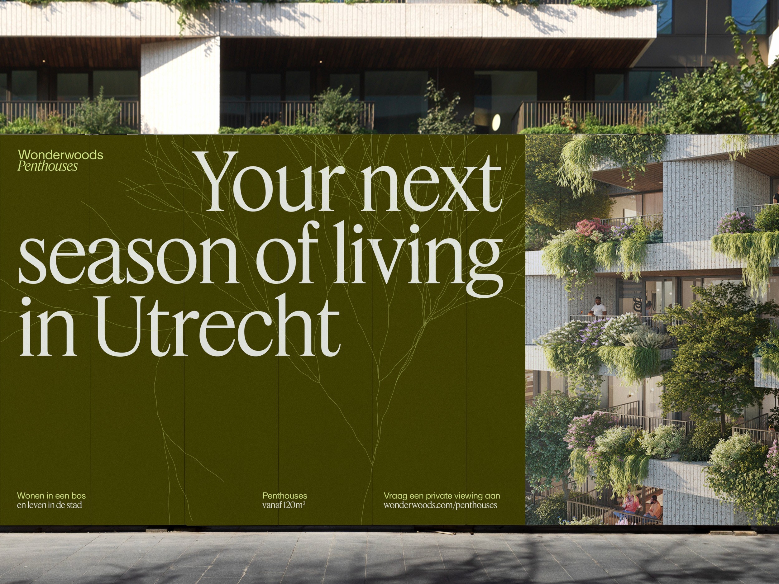
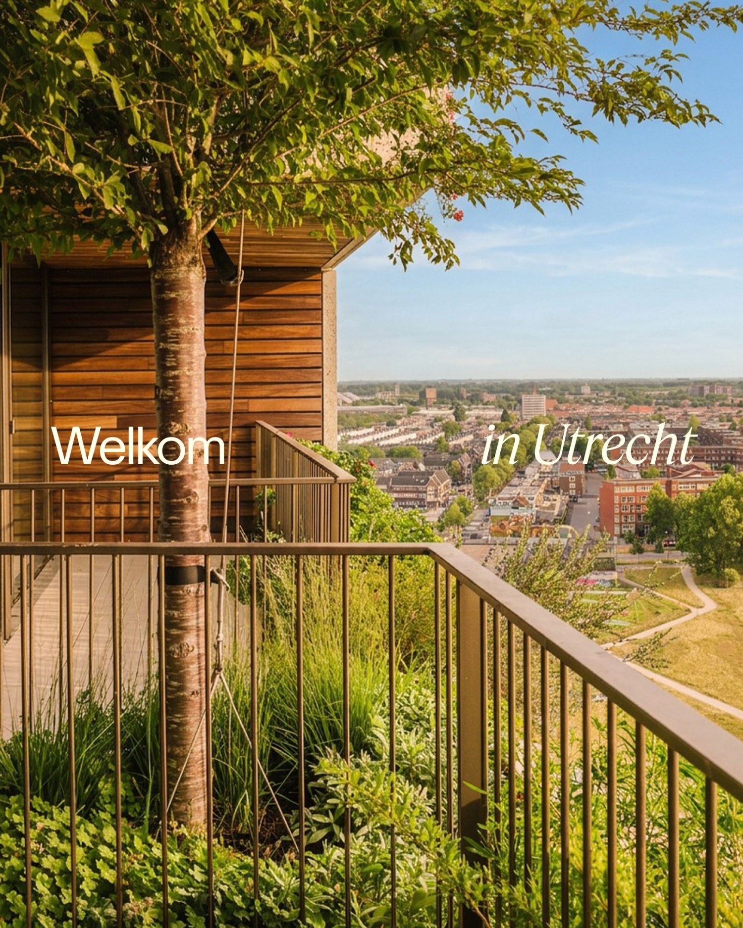
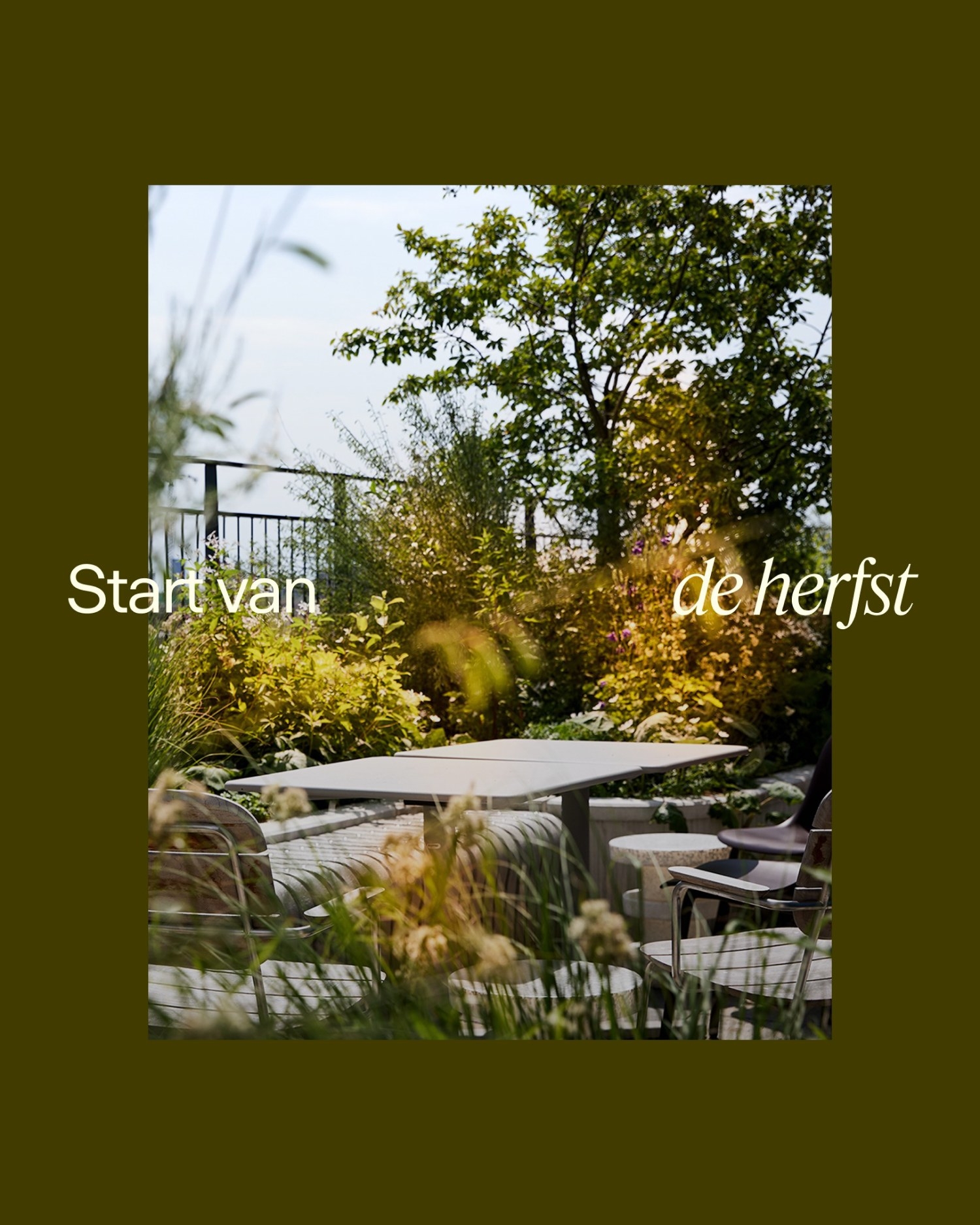
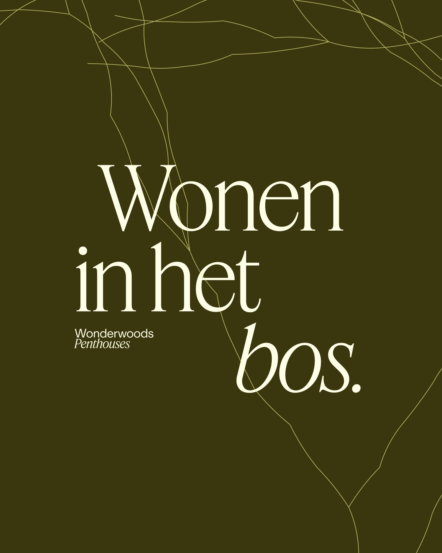
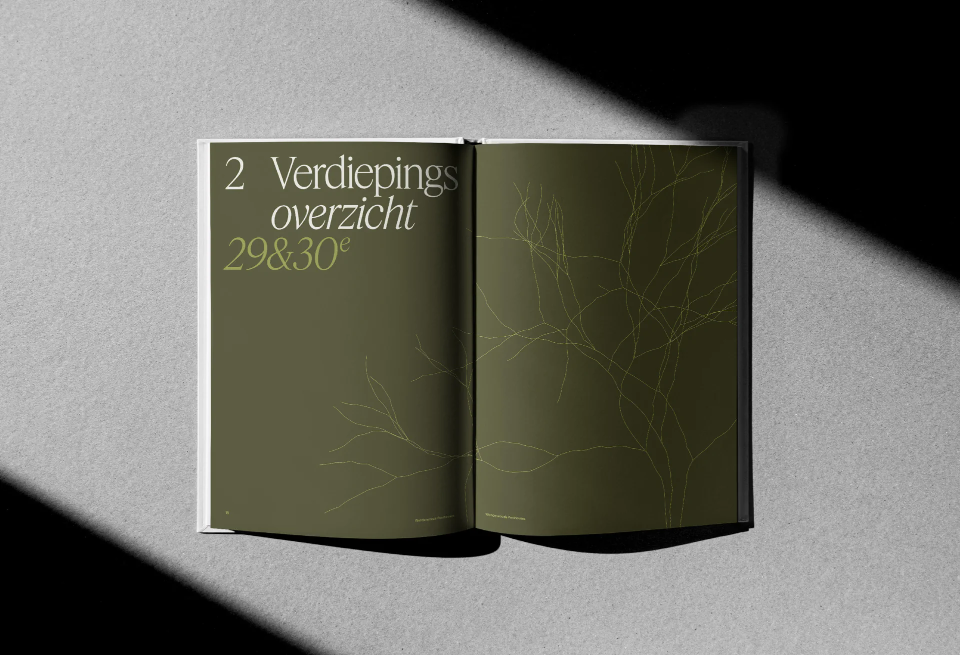
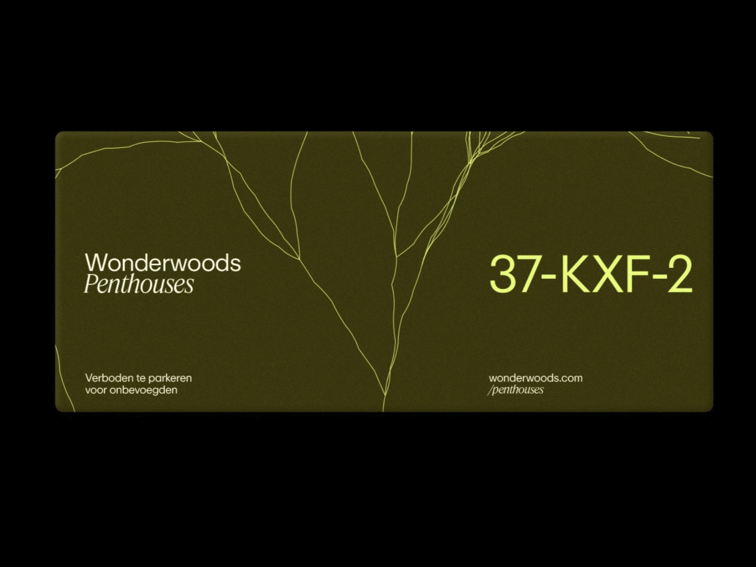
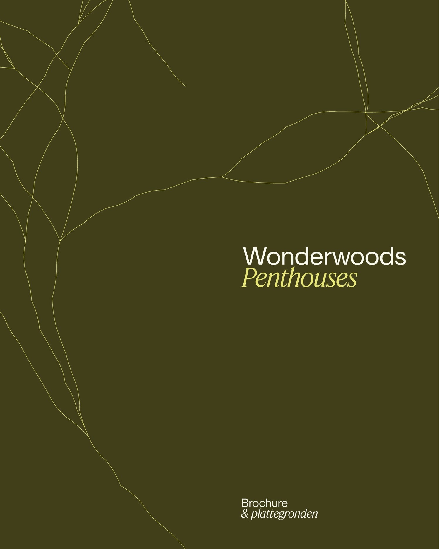
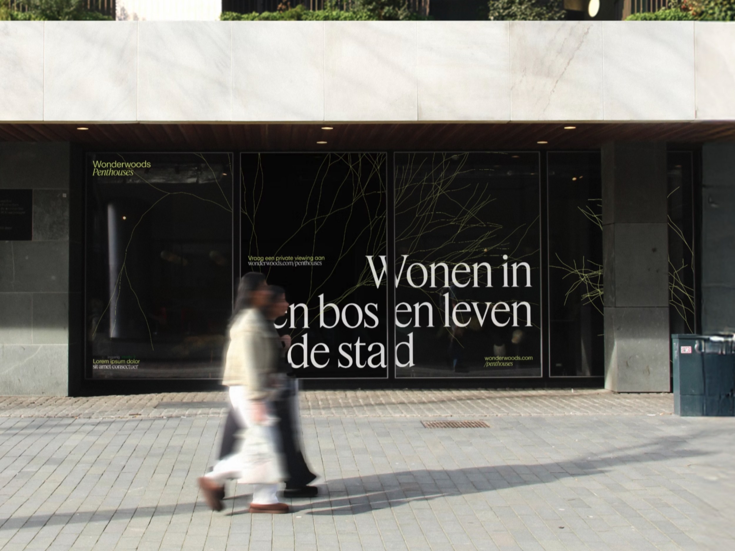
The identity builds on that connection. Root systems form the main graphic element and refer to the relationship with nature, the city and one's own network. For residents returning to Utrecht, that reference also takes on a personal meaning.
The branches can move freely across a surface or be used as a detail within a composition. This keeps the visual language recognisable across very different formats, from a brochure page to the shop windows around the building. Their organic shapes give the identity a softness that matches the forest above the city.
The wordmark combines modern letterforms with an italic accent. The same balance between classic and modern returns in the typography, with Feature Display for headings and residence names and ABC Repro for longer texts and practical information.
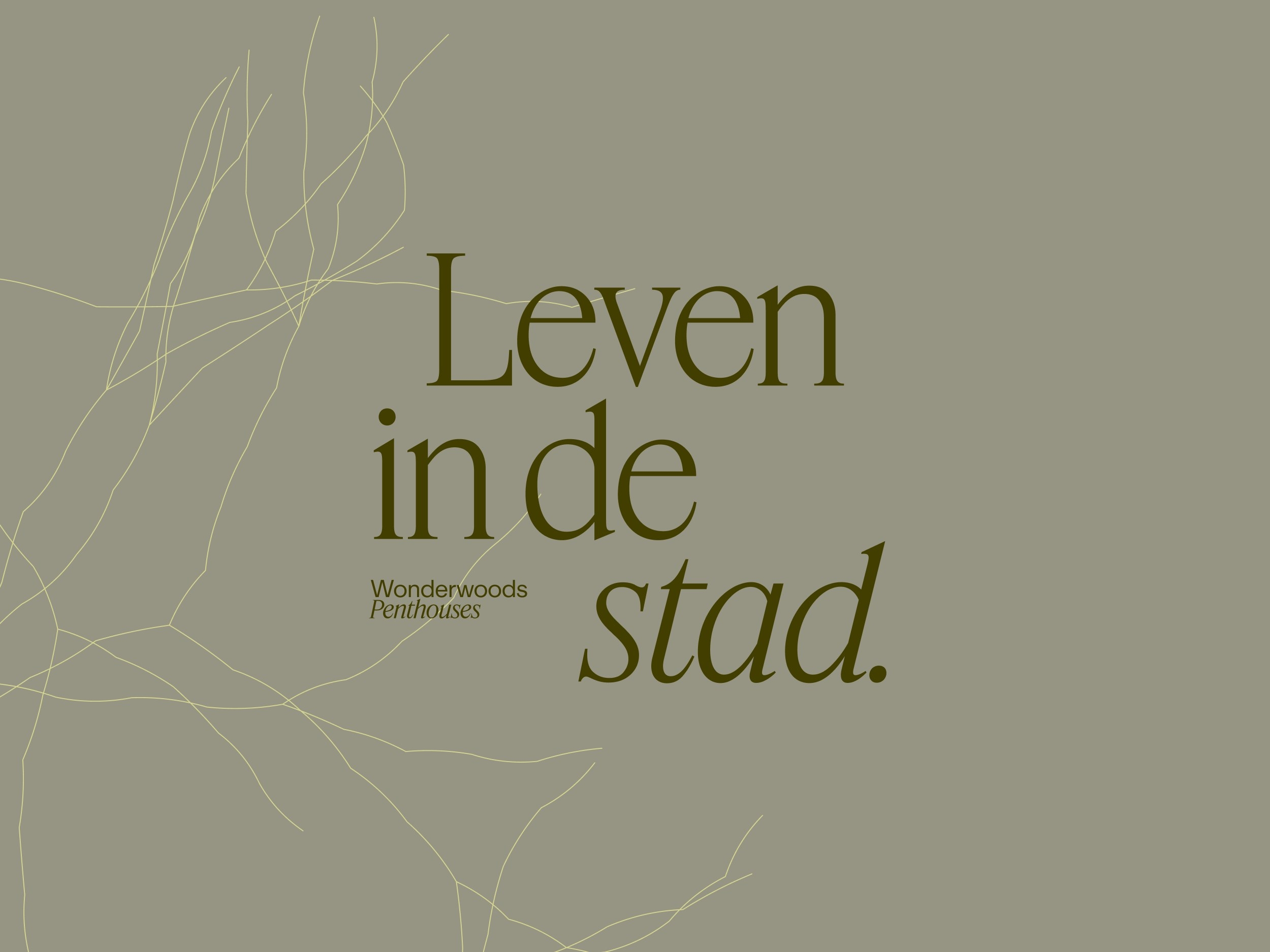
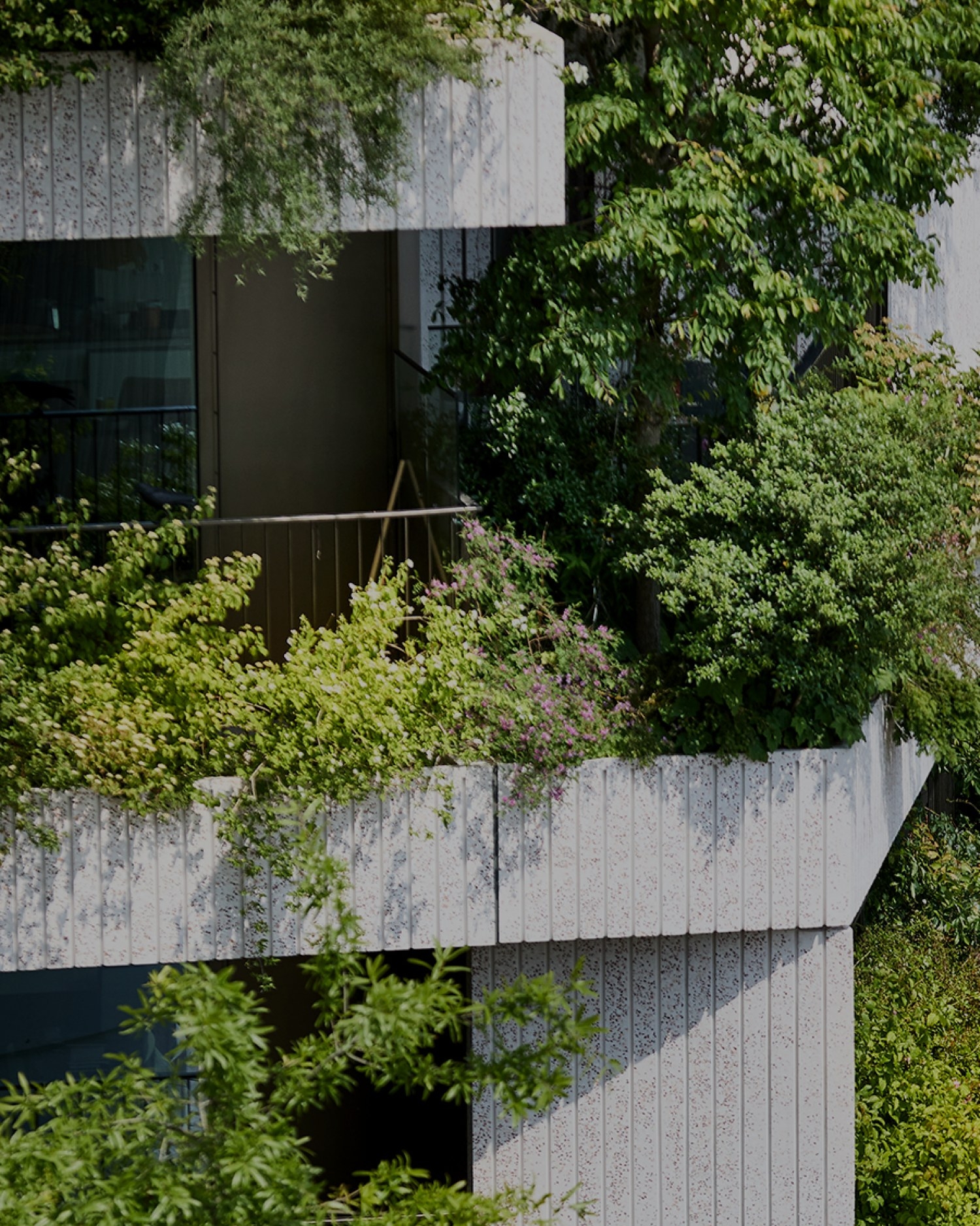
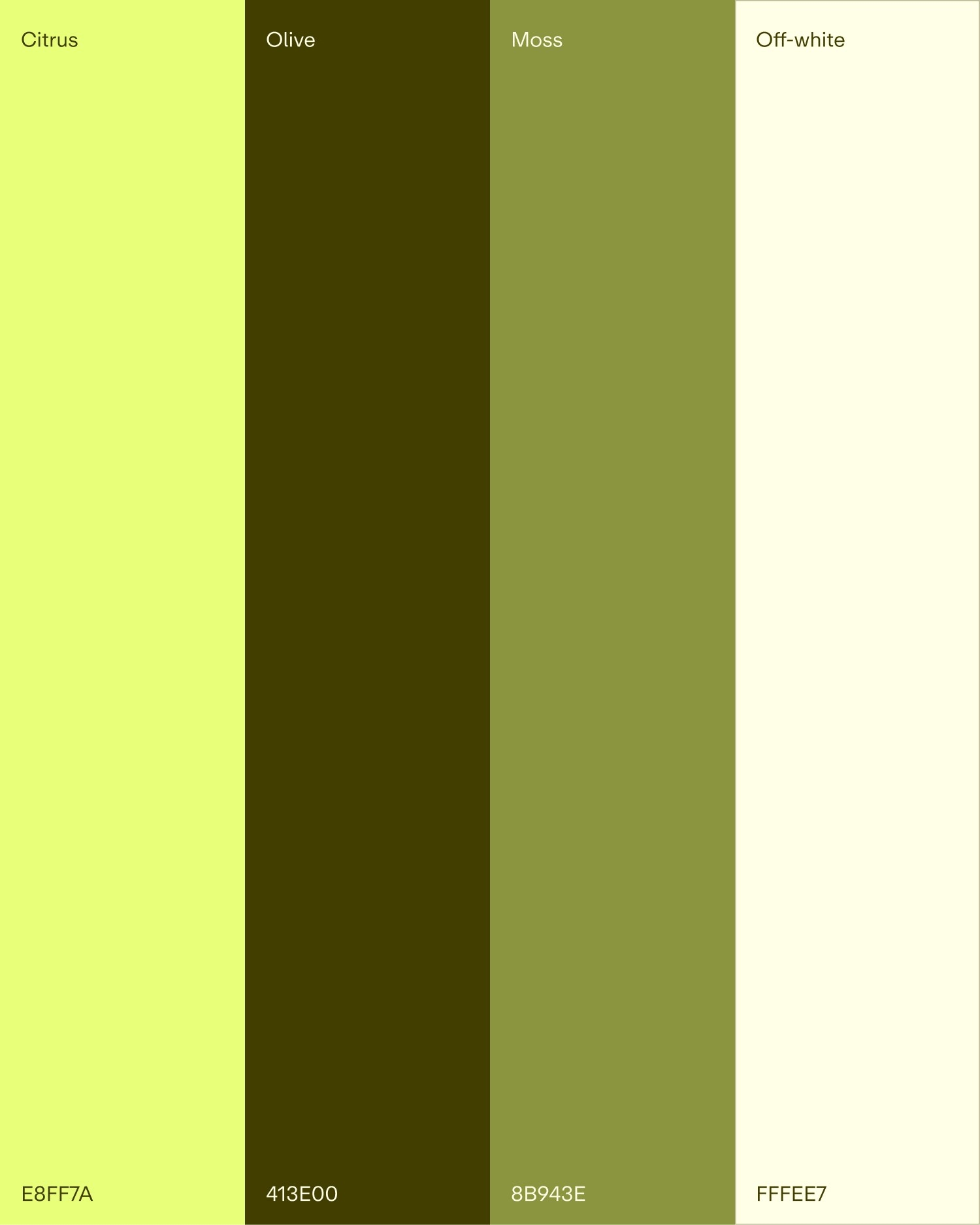
The warm olive green comes from the natural surroundings of the homes. Opposite it is Citrus, a bright tone that brings the energy of the city into the palette. Moss and off-white make room for quieter applications, so the identity can adapt to wherever it is used.
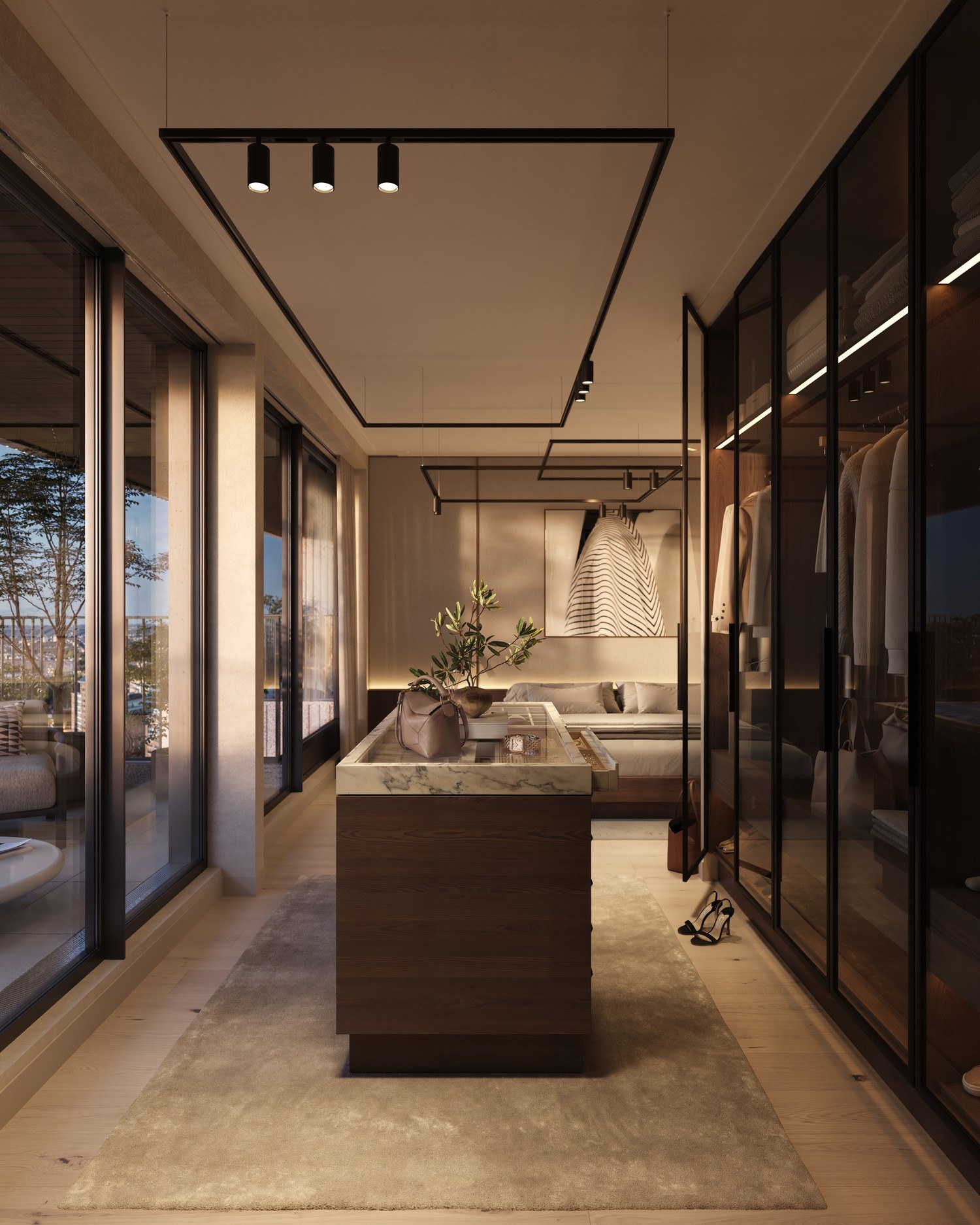
The layout is deliberately kept open. Photography gets enough size to really take in the spaces, while the root lines can move freely without overpowering the content. That restraint suits the intended look: attention goes to material, proportion and detail, as it does in a carefully designed interior.
The positioning called for a sales experience in which visitors could genuinely picture their next stage of life. The audience is used to personal service in hotels, restaurants and private banking. That level of attention became the starting point for the private viewing.
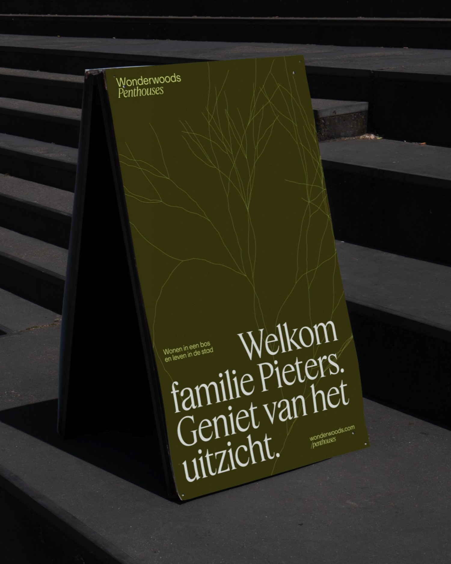
A private appointment gives the estate agent time to show the home and respond to the visitor's wishes. The welcome is prepared in advance, with a parking space reserved by licence plate and a welcome sign with the guest's name. These gestures make clear that someone is expected and let the introduction begin at ease.
The experience then revolves around the possibilities of life in the home. There is room to look around, ask questions and discuss how the layout and interior can match personal wishes. This gives the future resident a more active role in the viewing.
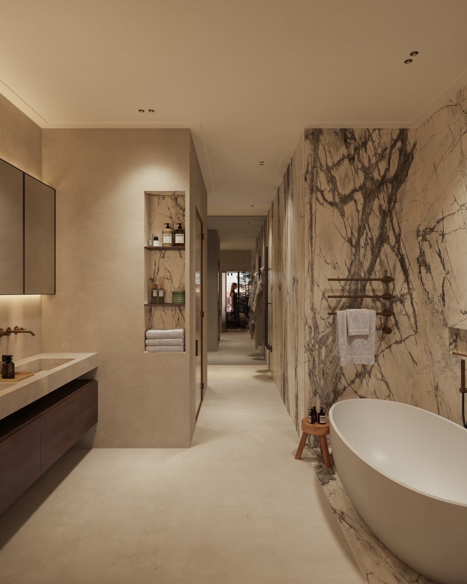
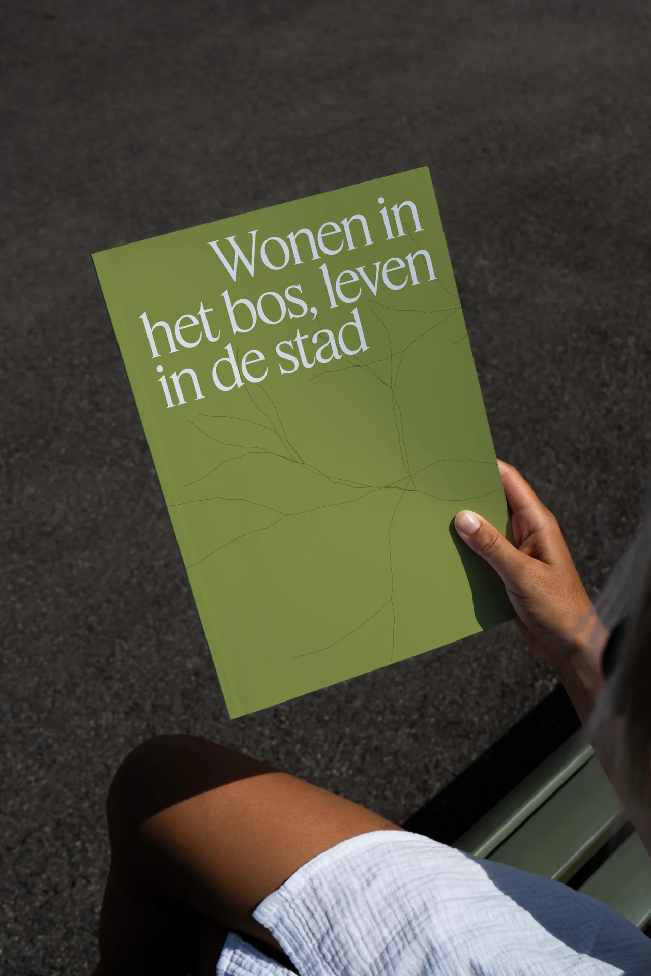
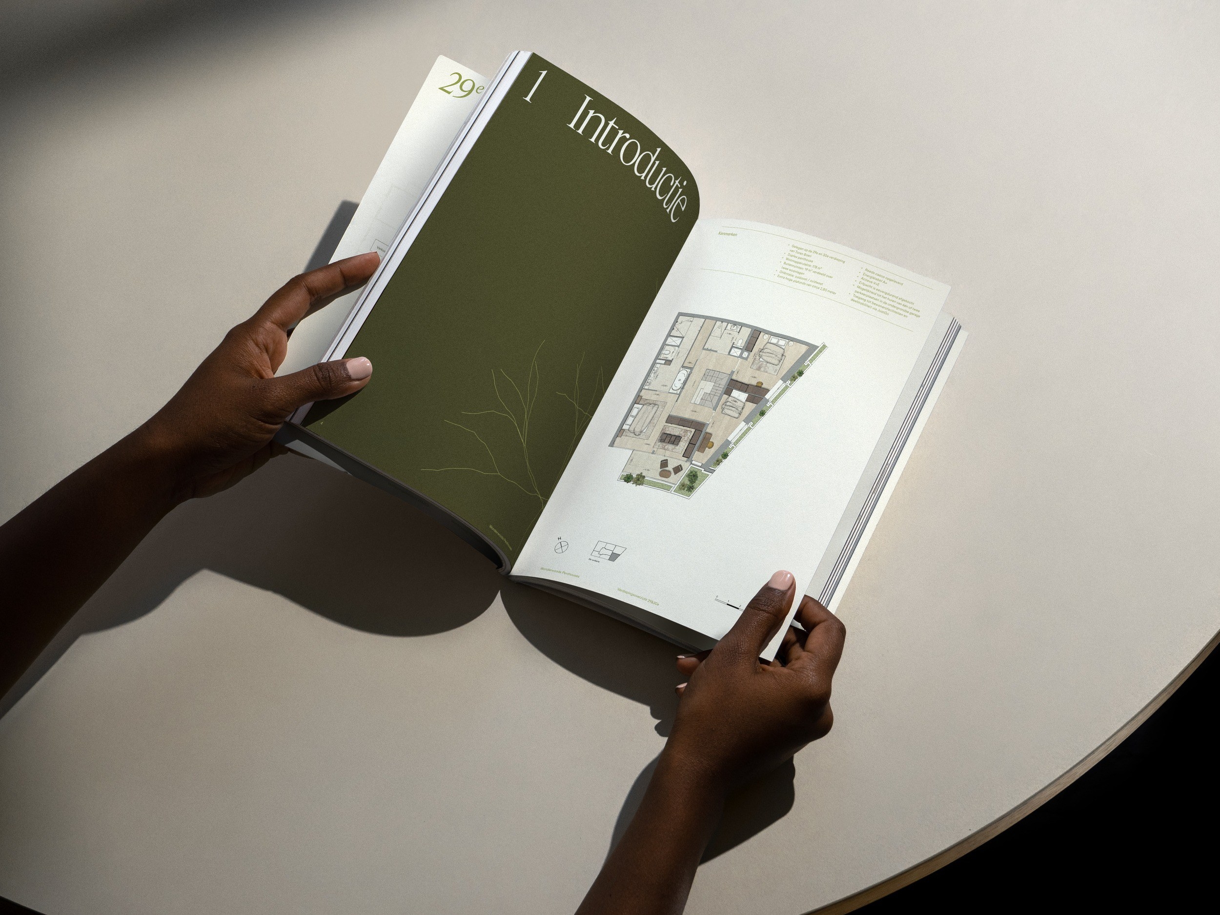
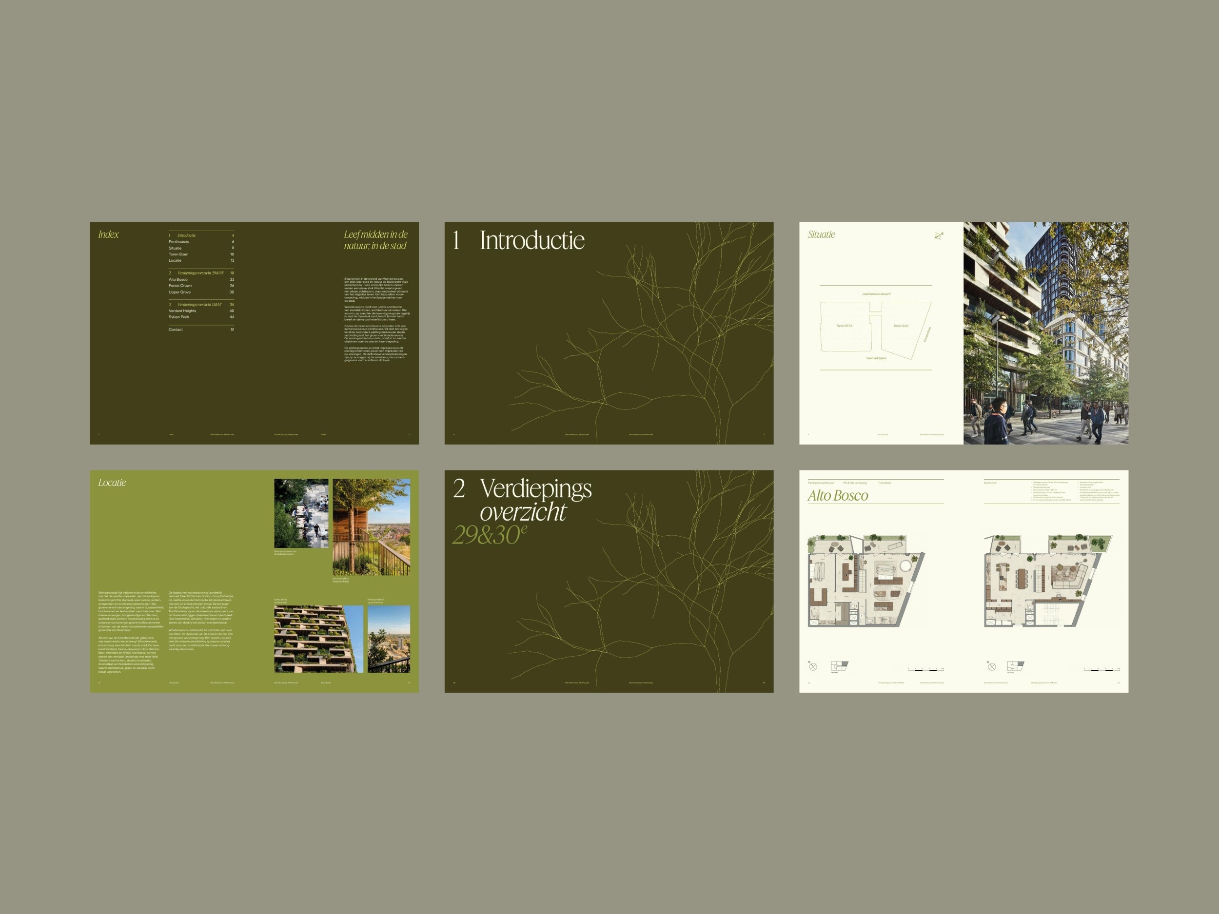
The brochure supports that introduction and starts with the surroundings that give the homes their meaning. Utrecht, the architecture and the vertical forest form the introduction, followed by the individual residences.
Alto Bosco, Forest Crown, Upper Grove, Verdant Heights and Sylvan Peak each received their own name and chapter. Interior images, floor plans and specifications bring together the possibilities of each home, within the shared identity of Wonderwoods Penthouses.
During the private viewing, the brochure and presentation panels are used to walk through the homes. Afterwards the brochure goes home with the visitor, where the conversation can continue with a partner or interior architect. The design invites you to leaf back and look at the spaces again.
Around the building, the identity takes its place in the shop windows, at the entrance and in outdoor advertising. The root systems literally connect the forest above with the street below.
Online, the story unfolds across six themes, from architecture and panorama to interior and location. This lets us show different sides of living there without telling the whole story every time. The seasonal concept also offers a natural reason to capture the changing greenery and the life around the homes.
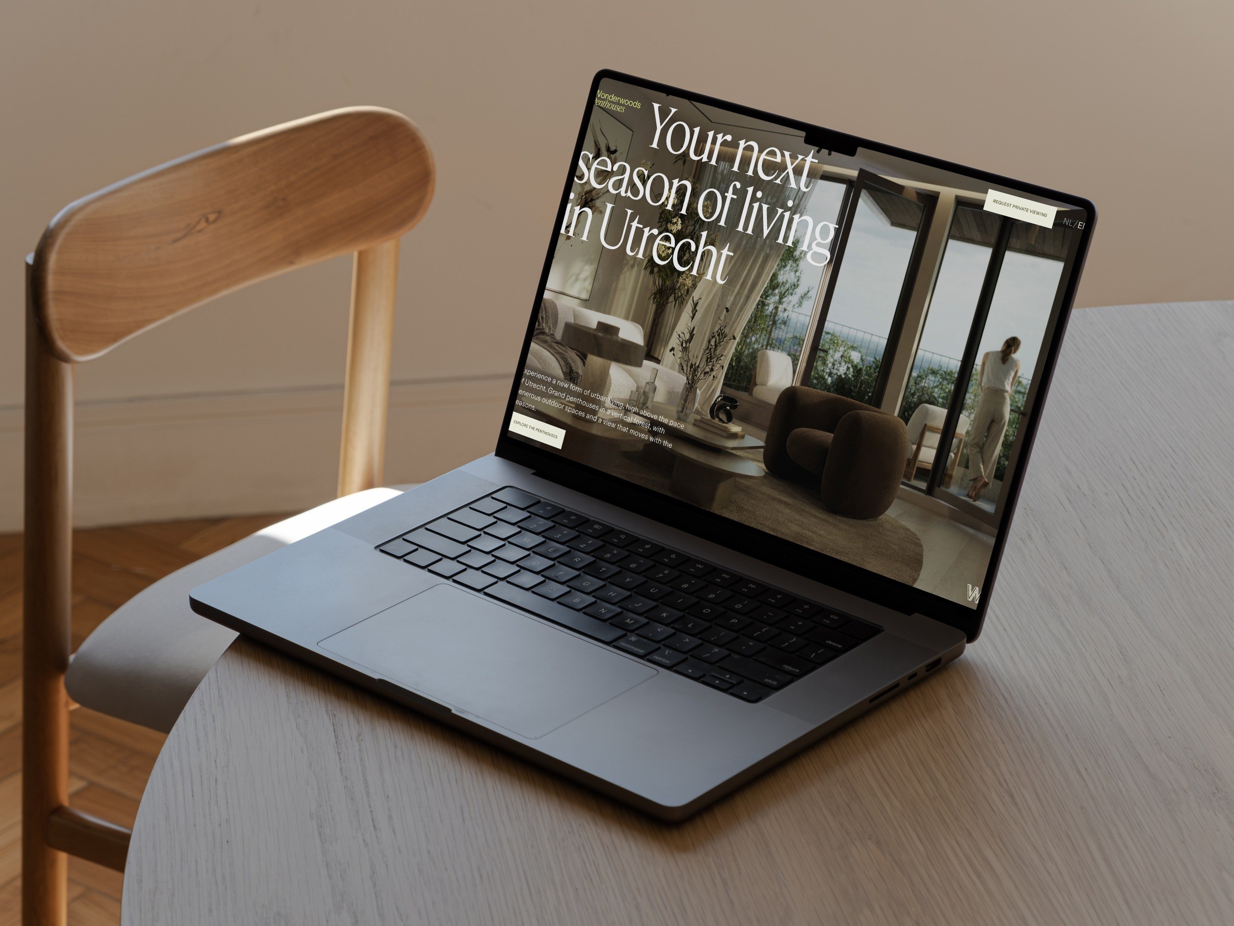
The website opens from the interior, so visitors see Wonderwoods straight away from a resident's perspective. Large typography and a limited number of elements give the opening a sense of calm. From there, the story of the building unfolds, along with the combination of living in a forest and life in the city.
The homes are presented as a collection, each with its own name, image, specifications and a link to a 360-degree tour. Additional information sits in overlays, so visitors can dig deeper without leaving the page.
That structure follows how we want the introduction to unfold: first getting a feel for the place, then exploring the homes, then making personal contact. The two estate agents are visible as direct points of contact, with the private viewing as the key next step.
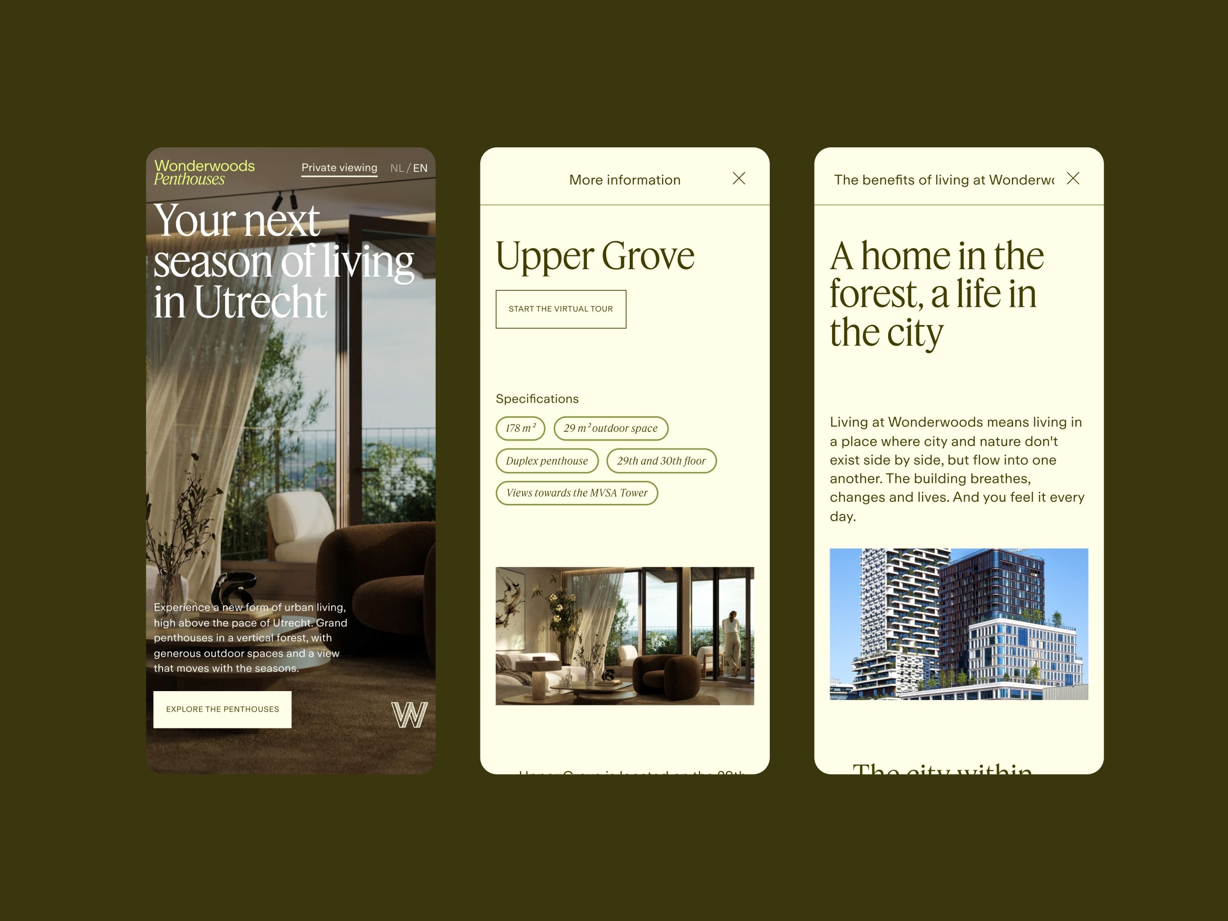
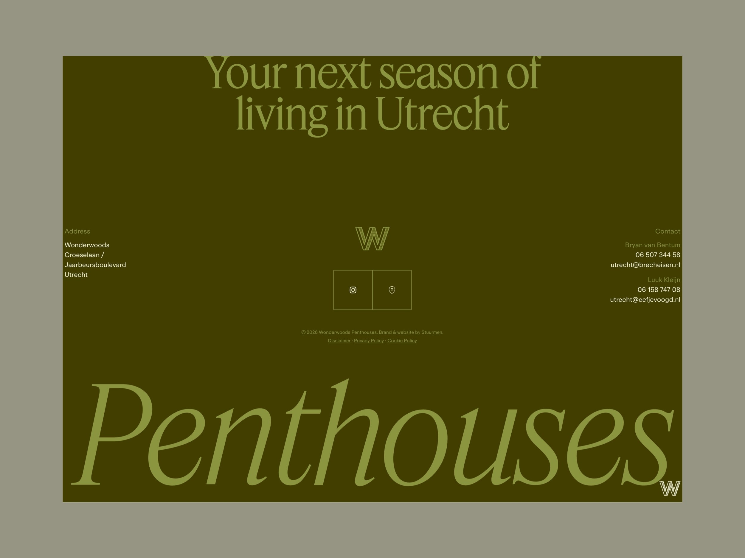
The five homes now share one story in which the architecture and the buyer's world come together. Your next season of living in Utrecht gives direction to the presentation and makes clear why this place can suit a next stage of life.
From the first introduction on the website to the welcome in the building, the same attention and design come back. The brochure, outdoor advertising and digital materials form one recognisable presentation, with room for the character of each home.
The approach helps prospective buyers look at the homes through their own plans for the future. Information on floor area, layout and finish remains available, within an experience that starts with how someone wants to live here.
Tell us what you are running into, what you want to change and what question lies behind it.