State of the art branding for tomorrow's workspace
Branding & Website
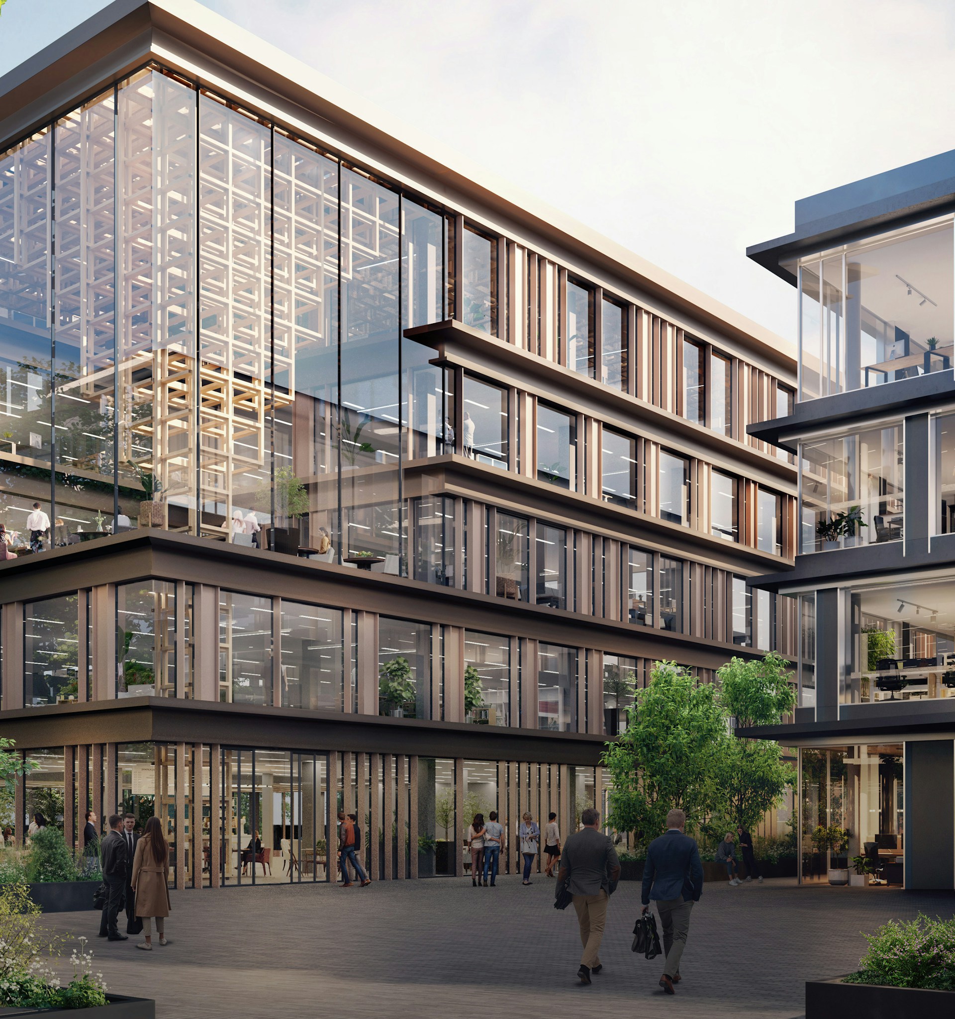
Situated within the green surroundings of Park 20|20 in Hoofddorp. The final piece of the puzzle is being developed.
Park 20|20 is already home to national and international companies such as L'Oréal Nederland, Bluewater Energy Services, Sony Benelux and FIFPRO. But Park 20|20 is not quite finished yet. A special complex is still being developed called ‘The Campus’.
It's a brand-new, first-class office location consisting of five buildings, each with its own distinct character and which together form a natural whole. Stylish interiors, exceptional restaurants and smart technology for increased comfort: everything about The Campus is state of the art. Bursting with creativity and just a stone’s throw from Amsterdam.


Brand strategy
Centuries old yet contemporary: Feng Shui offers spiritual wisdom. This Chinese philosophy was at the heart of the design and development of The Campus brand and revolves around bringing people in balance with their surroundings. Feng Shui uses the elements of water, wood, earth, metal and fire to create harmony.
The five buildings of The Campus are based on these elements and each has its own specific sub-identity. We developed and implemented this concept in collaboration with MVSA Architects and G&S Vastgoed. The construction of The Campus is now underway.


Brand design & Brand experience
Logo
The new logo that we developed for The Campus is simple but effective. The line is a nod towards the circular philosophy that lies at the root of The Campus. It also alludes to the ‘shell’ that contains the five buildings that make up The Campus. The individual logos of each of these buildings also use this circle, but they are filled with different shapes depending on their respective Feng Shui elements.


Colour
Premium, modern and sustainable. Just a few of the key words that were central to the design of The Campus brand. The new colour palette fits in perfectly with these concepts. We embraced a neutral palette base that is easy to apply in any type of communication. The bold green colour really grabs the attention and is mainly used to emphasise and encourage recognisability.


Design language
The green line from the logo is central in the design language of The Campus. The line symbolises ‘time’ and ‘future perspective’ and reinforces the tagline we developed: ‘The Future is Now’. In other words, now is the time to start thinking about the future. This is the time when we can make a difference, by interacting with our environment and its elements in a sustainable and circular way.


Website
The new website we developed for The Campus has two main objectives. On the one hand, it is important to communicate the circular concept clearly and to raise awareness about sustainability. That also includes the work environment. On the other hand, the goal is obviously to attract potential tenants. Our approach towards achieving this is by describing each building individually, presenting a few of the facts and allowing potential clients to schedule a viewing. In doing so, the concept is always used as evidence of the intentions.


Park 20|20
The Campus is located at Park 20|20 in Hoofddorp. While developing the brand for The Campus, we were asked to also handle the branding and website for area it's situated in: Park 20|20. The circular concept was used as the starting point here, too, but the branding was different as ‘accessibility’ was more important than presenting a ‘high-end’ image. We adopted many aspects of The Campus brand to the Park 20|20 brand, but gave it a lighter foundation, a different typography and a different colour palette.


