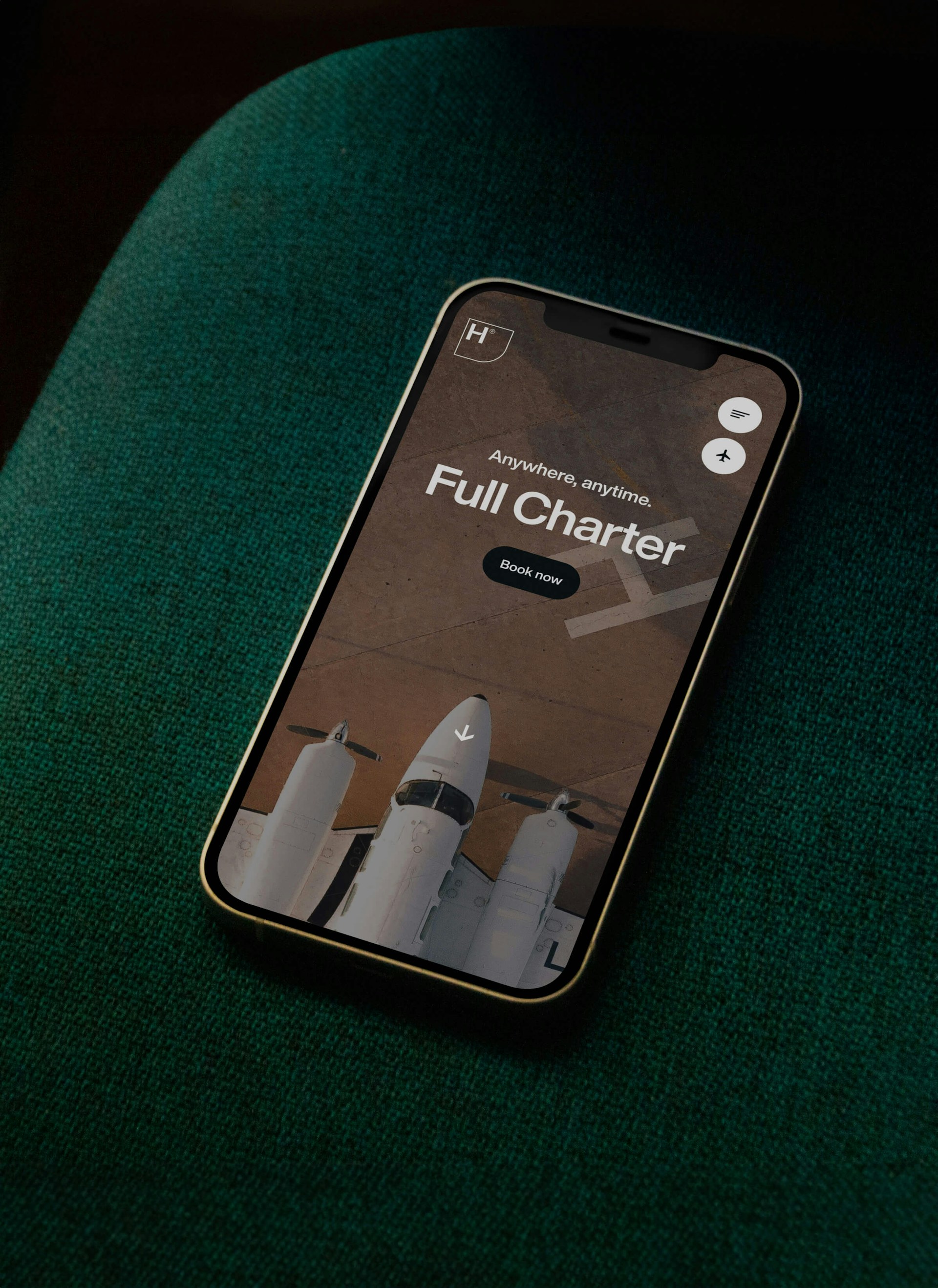
A skyward rebranding and an award-winning website
Branding & Website
Cutting-edge technology, extensive industry expertise and a solution-focused approach. Just a few reasons why Hyer® is turning the private jet charter industry on its head.
We launched a technology-driven strategy, a new name, a new brand and a new website, featuring a bold portfolio of services.
We designed and built a patented booking platform that is entirely dedicated to providing unsurpassed, personalised service.
Awards
Brand strategy
The aviation industry focuses mainly on speed and efficiency, which means that passengers are very quickly seen as numbers. The norm can be likened to a never-ending conveyor belt of people with no regard for personal service.
Hyer® proves the opposite can be true and that is why we came up with the tagline ‘Anywhere and at any time. You’re in control’. Hyer® strives to provide unparalleled experiences. Experiences that perfectly align with passenger needs. Experiences that are more than just ‘from A to B’. We call it ‘Personalised Aviation’.
Brand design & Brand experience
Logo
The logo that Hyer® was looking for didn't necessarily radiate luxury, but did exude a premium feel. The new Hyer® logotype is sleek and minimalistic, yet it's absolutely unique. The ‘H’ is composed of a combination of an ‘F’ and a lower case ‘L’. So, at first glance you see ‘Hyer’, but when you look a little more closely, you see ‘Flyer’. The middle section of the ‘H’ makes a visual reference to the vertical stabiliser of an aircraft. That part is responsible for keeping a plane in balance, a philosophy that fits in perfectly with the Hyer® brand.
The complete Hyer® logo provides the word mark with a solid background. Here we have combined sleek lines that exude exclusivity with rounded lines that radiate flexibility and personality. Together, they create a shape that is completely in tune with the brand strategy, while also laying the foundations for further design language within the brand.
Design language
The design language used within the Hyer® brand is an extension of the shapes found in the logo. By playing with both sleek and rounded lines, we have created a recognisable style that can be applied to a variety of communication mediums. This is also reflected in the visual pattern that we developed.
Website & Booking platform
Hyer® asked us to develop a booking platform that would be functional but, even more importantly, conveyed the brand’s philosophy. Innovative, user-centred and premium were some of the key concepts here.
We built a design system that makes it easier to create features now as well as in the future, while at the same time maintaining brand consistency.
